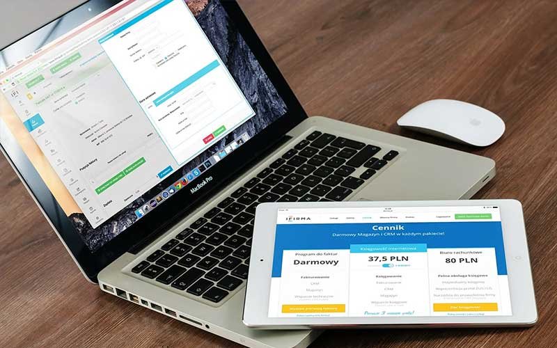
What are the tips to develop a user friendly web application
The website has evolved into something much more than plain text, simple design, and limited information. The user today expects it to be a sort of entertainment, regardless of it being ap professional website or an E-commerce portal.
Entertainment in terms of good images, Interactive video, trustworthy content, comfortable overall experience. Everything from placing your CTA at the right spot can create a good impact on making an aesthetically pleasing experience to the user that lures their attention.
Here are few extremely creative and catchy User-friendly web development Ideas.
Learn what your User wants
Take the time to evaluate the needs and interests of your user and what they wish to see on your
page. Get input from the audience and discover all the much needed and missing element in your current site. Users will often give you a precise feature and fixation that you should not forget to inculcate in your website, only if you feel it is a reasonable feature to add.
Speed is Everything
37% of the visitor will bounce when they experience your website page load time taking more than 5 seconds. Visitors are impatient, and that is because they have immense alternatives for seeking products and services and you are one amongst the many. Your page speed time should be quick and efficient, therefore as a business owner optimizing your mobile and desktop page speed is crucial.
Don’t Add Popups
You might think that a regular popup can add as a factor for a potential customer to interact with you. However, popups can be annoying especially when it occurs more than once on your website. If you have an attractive website, they will tend to go through the entire site and if needed take appropriate action through the CTA button.
Provide Detailed Information
When a visitor lands on your page, they expect certain information that will help them make an informed decision about you and your business, your product/ services. Therefore, your website must have everything that acts as a solution to the problems they have. If you keep them unanswered, they are likely to feel frustrated and disinterested, therefore heading to a competitor’s website. The more you go in-depth, the better they feel to make an offer.
Easy Navigation
When a visitor lands to your site, they shouldn’t feel lost, and that can be done with proper navigation tool provided to them. It will reflect their time and journey on your website, thus giving them a reason to stay longer and search for what they have landed for on your website. Also, you shouldn’t have too many navigation bars, it can be bulky and quite irrelevant to maintain it. Keep it simple, short, and crisp so the visitor is aware of where they are heading after they click on the
toolbar.
These things will instantly make your website more user friendly and it will keep your audience entertained for longer. This will also give your website enough improvements if you keep a constant update to the content, design, and overall look & feel.


Leave a Comment